Blog ·
Build a reference board without copying somebody else's cover
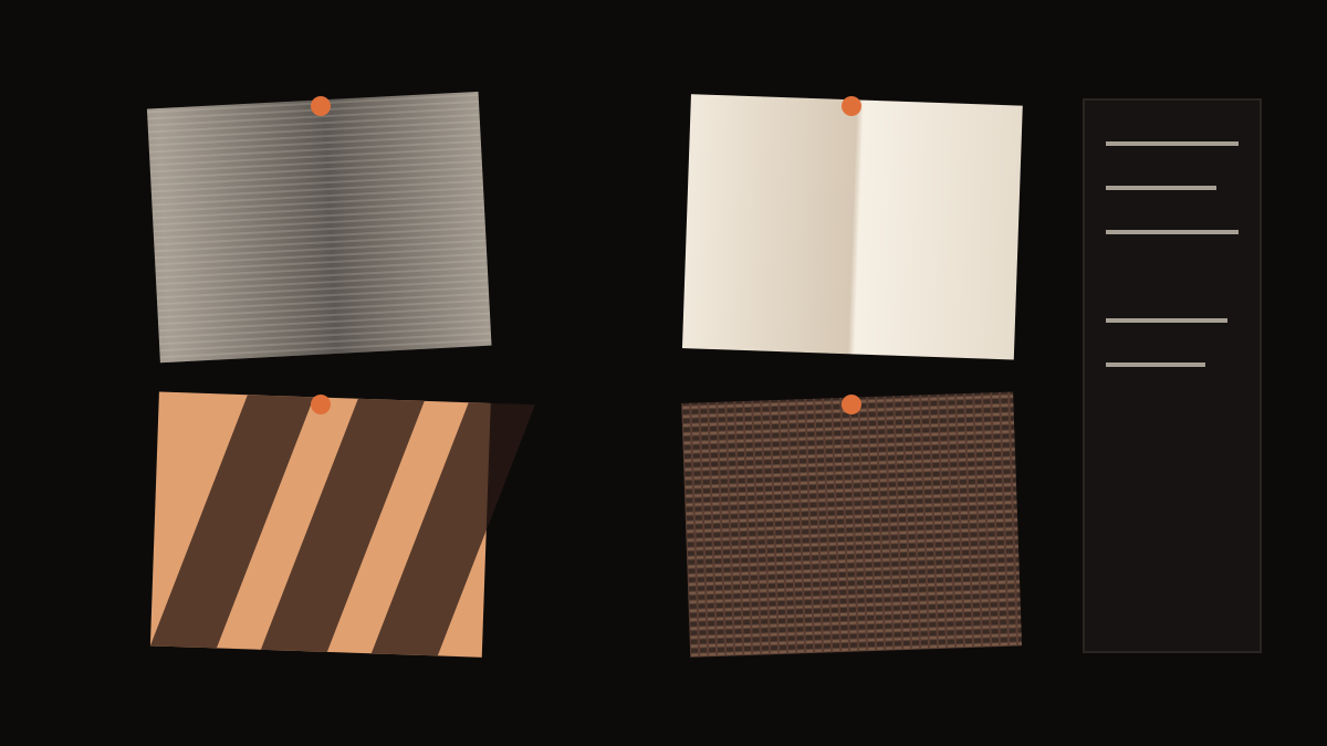
A reference board helps you explain what you want before anyone makes it. The trouble is that most boards are full of other people's finished covers, and finished covers pull you toward copying them: the same pose, the same colours, the same layout. A better board breaks references into separate qualities, takes one quality from each, and writes down what not to take.
Four slots, one quality each
Give the board four slots. Each reference earns its place for one reason only.
- Subject: what is in the picture. A person, an object, a place.
- Light: where it comes from, how hard it is, what colour.
- Surface: the material quality. Paper, metal, skin, fabric, film grain.
- Composition: where things sit in the square and how much space is empty.
The point of splitting them is that no single reference supplies the whole cover. If one image fills all four slots, you are describing a copy.
Use, avoid, source
Under each reference, write three short notes.
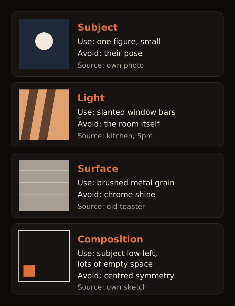
- Use: the exact quality you want. "Slanted window bars of light on a wall."
- Avoid: what you do not want carried over. "The room, the plant, the colours of the wall."
- Source: where it came from. Your own photo, a material you photographed, a film still you are only using for light, a painting in a museum.
The "avoid" line matters most. It is what stops the shadow reference from turning into the same kitchen.
Use your own material where you can
Some of the best references are not images at all. Photograph surfaces around you: brushed metal on an old appliance, the fold of a sheet of paper, the light through your blinds at a particular hour, the weave of a jacket. These are free, they are yours, and they are specific in a way stock references rarely are. A board made mostly of your own photos is also much less likely to drift into imitation.
Resolving contradictions
Boards often contain references that disagree: soft window light and hard neon, warm paper and cold metal. Decide which one leads. Write it down: "Light: soft window light leads; neon only as a small accent on the right." If you cannot decide, the song can: which one sounds more like the record? Our guide to what cover art should show helps if the subject itself is undecided.
A note on rights
Using a reference for a quality, like how light falls, is different from reproducing someone else's image. Do not trace, collage or closely reproduce artwork, photos or covers you do not have rights to, and do not put a reference image into a final cover. Distributors reject art you do not hold rights to, as our sizes guide notes. This is general guidance, not legal advice; if you are unsure about a specific image, ask someone qualified.
A worked example (illustrative)
An invented artist wants a cover for a cold, metallic electronic track about missing someone. Her board:
- Subject: her own photo of a single folded letter. Use: one folded sheet. Avoid: handwriting.
- Light: blinds in her kitchen at five in the evening. Use: slanted bars. Avoid: the kitchen.
- Surface: an old toaster. Use: brushed grain. Avoid: chrome reflections.
- Composition: her own sketch. Use: subject low-left, empty space above. Avoid: centred symmetry.
The cover that results is a letter on brushed metal, crossed by bars of evening light, sitting low in an empty square. None of the four references looks like it.
Copy this board template
Subject:     use ____ / avoid ____ / source ____
Light:       use ____ / avoid ____ / source ____
Surface:     use ____ / avoid ____ / source ____
Composition: use ____ / avoid ____ / source ____
Leads when they disagree: ____
Bring it to your song
Soundae starts from your song rather than a reference board, and you can describe what you want in your own words when you refine a direction. A board like this makes that description sharper; results will not reproduce your references exactly. Start with your song.